
Validation Fail: Why Fan-Shaped Validation Plots Betray the Team

We all want healthcare procedures to be less invasive and more informative! As someone who evaluates HealthTech and MedTech AI startups (among most other industries), a common plot founders include (when they haven’t hacked their AUC) is how well their typically less invasive product performs relative to a more invasive gold standard. Here’s how to generate that plot, what to look for, and why.
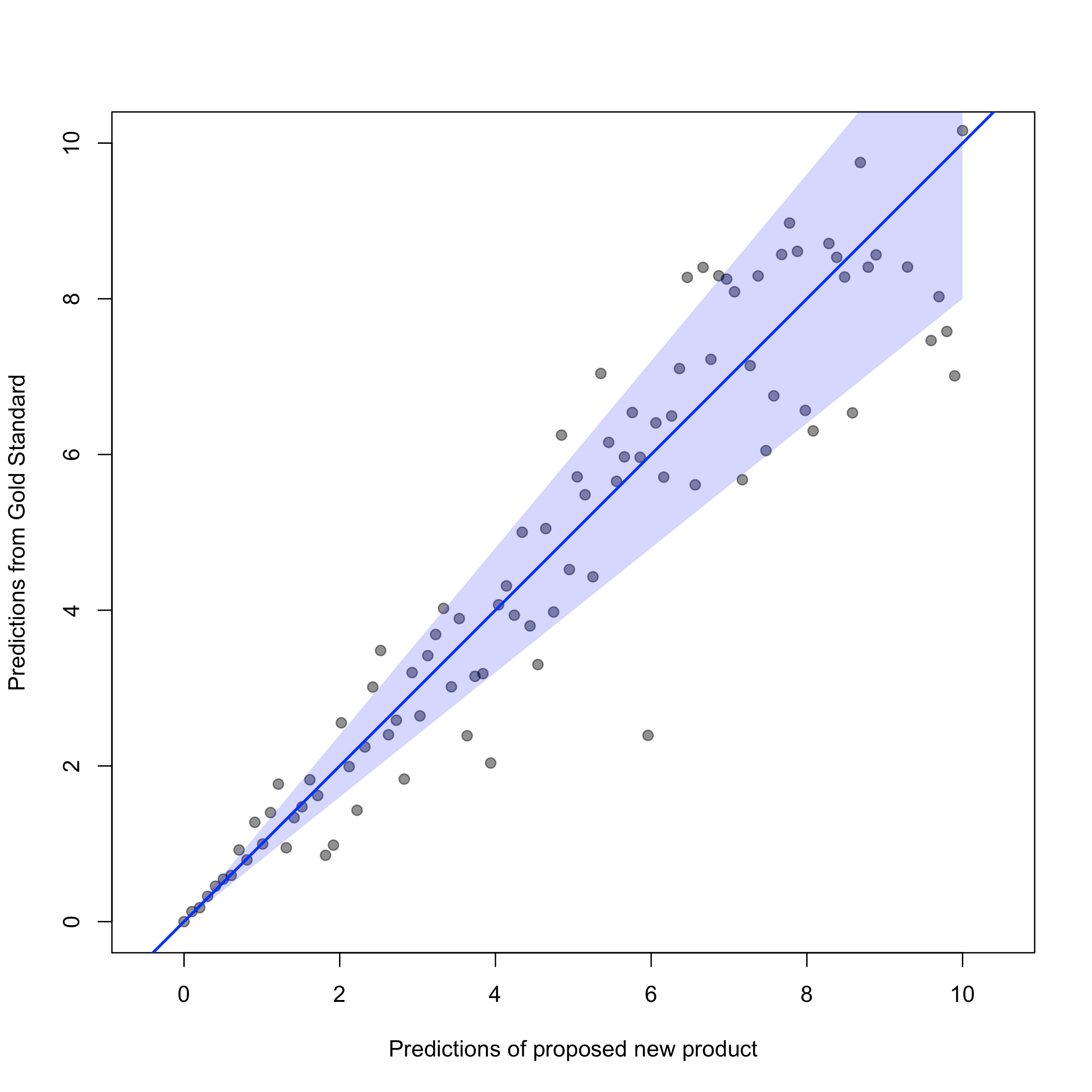
x=y Visual
A set of patients has opted in to both procedures. One way to compare results from both procedures is visually, by plotting each patient on the x- and y-axes based on each procedure’s results. For example, if an invasive procedure measuring fetal heart rate (e.g., the “gold standard”) recorded a heart rate of 105, and the non-invasive procedure also recorded 105, the coordinates of the point would be (105, 105). There would be one point for each patient’s results across the procedures.
As you can imagine, if the non-invasive procedure closely mimics the gold standard, each of the patients’ measurements across both should be nearly identical, we should expect to see the scatter of points to be around the line x=y. That’s the 45-degree line in the chart; it should always be included as a reference point, running diagonally across the plot (from bottom left to upper right).
A missing 45-degree reference point also suggests that the results aren’t sitting on the 45-degree line; check the axes! The team may be showing a regression line instead, to hide the bias.
Where the Team Went Wrong
Any fan-shaped scatter of points along the 45-degree line (such as the one shown here), then, suggests that the non-invasive procedure systematically misses the mark for (many) patients. Any variability with a trend (in this case, a widening cone, pointed toward the top-right or bottom-left in the plot) in the validation plot is called “heteroskedasticity,” which, as one of my former students pointed out, is “a cardinal sin!”
That’s because the plot shows that information that’s outside the 45-degree line and in the cone is unaccounted for in the non-invasive procedure, doesn’t mimic the invasive procedure as closely as advertised, and, even worse – illustrates how much the performance of the non-invasive procedure degrades for the sickest patients (in the top-right of the plot)! If this were a device measuring heart rate, It might be accurate at a resting heart rate but dangerously wrong during an SVT. That’s a liability!
This seemingly advanced concept of non-constant variance is covered in any introductory, Statistics class!
Any team1 pitching itself as a data-driven or AI-focused startup that misses this trend in their validation plots is, unfortunately, not the right team for the job. They didn’t take the time to even look at the plot, or investigate what happened and why, to try to mitigate it. What other fundamental knowledge is the team missing?
If the plot lines up perfectly along the 45-degree line, why hasn’t someone else solved this already?
What to Consider Discussing in Diligence
